You can switch to a different chart type at any time. If additional measures or attributes are required for the chart type you select, Visualizer provides the necessary guidance. You can also combine multiple chart types.
Change the Chart Type for a Report
- In Visualizer,
add one or more measures and attributes to plot a chart.
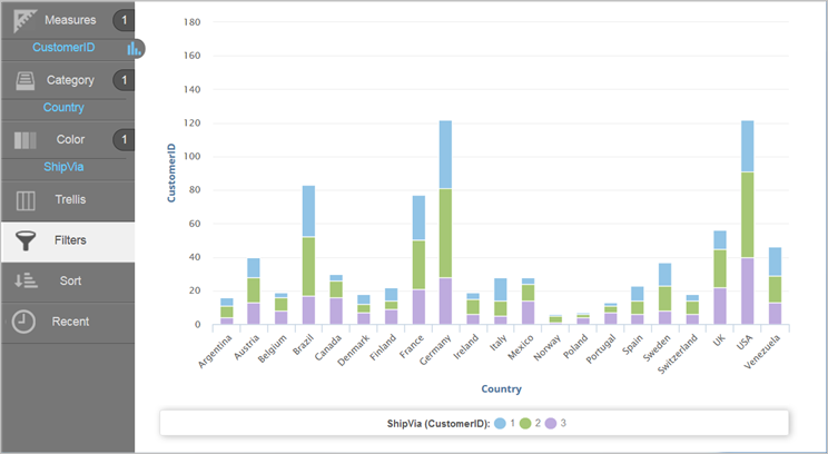
Example: Start with a column chart.
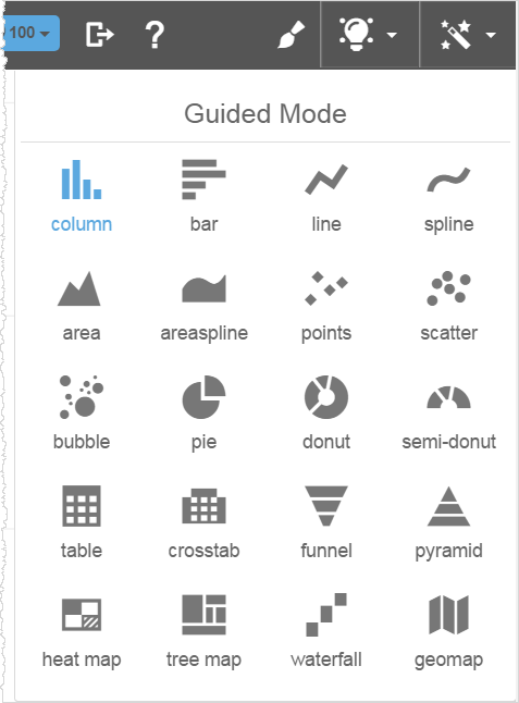
- Click
Change Visualization to enable Guided Mode, which displays the
types of available charts. The current chart type is indicated in blue.

- Select the chart type you want to use.
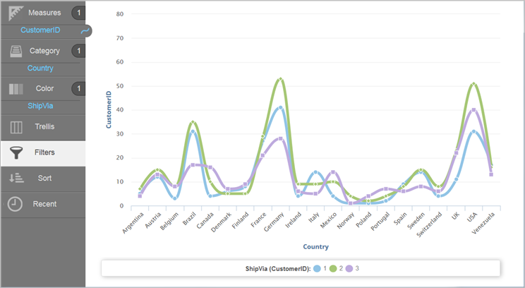
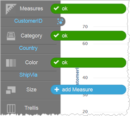 Note: If you select a chart type that requires more measures or attributes than you currently have, Visualizer prompts you to add the required attributes or measures to the necessary buckets. You can either add the additional columns required for the chart or select a different chart type that is appropriate for the measures and attributes you already have.Example: You can change a column chart to a spline chart.
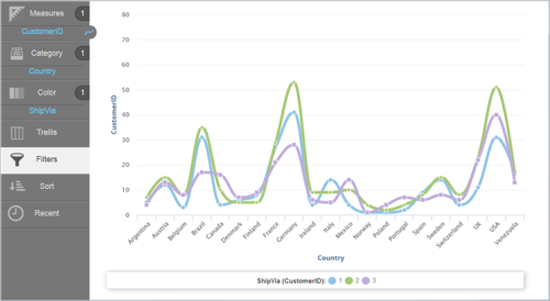
- Click Save.